Stuti Kathuria: 80% of your PDP visitors will never see the add to cart CTA.
Here's why:
- Your price seems too high.
- Your product does not look attractive.
- Your PDP has too much info in initial folds.
How does it affect?
- This impacts your add to cart rate.
- And your conversions, revenue, profit.
A visible add to cart CTA is key to a successful online business.
Visible. But not placed «too early».
Not before your visitor is ready to click on it.
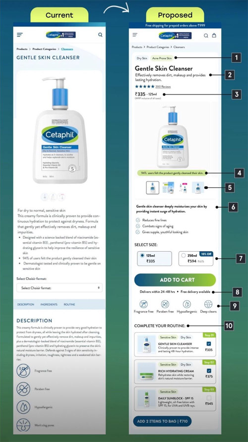
In this example, using Cetaphil's PDP, I've made 10 changes that make the add to cart CTA more visible and increase the conversion rate.
- Add the «use case» of your product above the product name. What purpose it solves. Helps the visitor quickly understand if it's for them.
- Add a 1-2 line benefit-driven summary of the product under the product name. This gets the user interested and reading further.
- Optimize the price area by mentioning quantity, ml, units (if this is applicable to your product). This shows them value for money and justifies price.
- Highlight a result the user can expect with numbers on the image. This should be proven by an actual study.
- Add image thumbnails. Make sure the image gallery in a one-stop place to get all key information about the product.
- Add a short summary in bullets before the add to cart. Keep the bullet points to 1 line on mobile.
- Show the quantity and their price upfront and not under a drop-down. If you have more than 4 options, you can consider having a drop-down. Highlight savings for all options.
- Optimize the add to cart area by highlighting the delivery time and rate.
- Highlight product USPs or brand USPs below the add to cart in a visual format using icons. Make sure this info is unique and not repeated above.
- Add an upsell section like «Complete your routine» or «Complete your look». This increases your AOV and helps the shopper find relevant products easily.
Other UX/UI and CRO changes I did:
- Added an information bar with shipping info.
- Added a cart icon in the logo bar.
- Reduced the image height.
Additional observations:
- Show don’t tell – consumers don’t trust official brand produced content.
- So, I’d also suggest pulling in curated UGC, customer claims, reviews etc into the UX.
- Use shoppable video to distill all of this down to a high-fidelity format that’s still easy to consume (mobile-first, swipeable) and is focused on conversion (in-video add to cart for multiple featured products).
P.S. If you want to maximize your PDP’s potential, start by understanding your visitor's behavior and the gaps.
Start with one change, measure impact, and iterate for continuous improvement.
Rate this article
5/5
1Other articles

 827
827


